Universal Principles of Design is a book that I should’ve read earlier as a product designer. It gave me new perspectives in thinking about the tricky design problems or situations I encountered in the past, and new ideas on how to approach a design project in the future. Below are 5 principles that stuck with me after I read this book.
Performance ≠ Preference
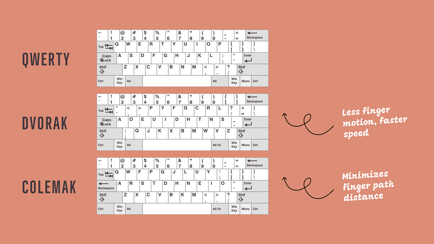
The best performing design is not necessarily the most preferred design. The Dovrak keyboard layout is such an example. What leads to a preferred design is often a combination of factors rather than just performance: Is it pleasing to look at? Does it follow or go against existing standard-of-use?…

So if we created a well performing product but it fails to gain momentum or market share, perhaps it’s time to drop our attachment and exam the reality. To obtain reliable information on preference versus performance, we can observe how users interact with different designs in context, as the book suggests.
This principle also tells us that we should never ask users directly whether they’d like to have a product with better performance, because such reports from the users can be unreliable.
Reality is complex and to me this principle goes beyond design: A job candidate that gets hired is not necessarily the most qualified. A highest-educated person in life is not always the most successful one…
Design by Committee Isn’t No Good
I used to think that design by committee is bad and should be avoided. However, this book tells me that it’s actually often needed and desired.
When a project is complex, the consequences of error or failure are severe, and stakeholder buy-in is important, design by committee is necessary and preferred.
When a project is urgent and straightforward, the impact of errors is relatively small and tolerable, and stakeholder buy-in is not needed, design by dictator is okay.
It’s inevitable that in the process of design by committee, the edges and idiosyncrasies in a design are softened or evened out as consensus is built among stakeholders. However, the resulting design also tends to be more balanced and stable. The book illustrates this with the design process of the one world trade center tower.

Complex projects inevitably involve some degree of design by committee. So as designers, we’d better get used to this phenomenon and learn how to better collaborate with and manage stakeholders.
Pay Attention to Propositional Density
Propositional density is a new concept I learned from this book. It’s refers to the number of ideas or meanings that can be derived per element in a design. It’s this magical thing that separates an interesting design that has depth from a boring one. The higher the propositional density, the better. Good examples with high propositional density according to the book include the Apple logo and the Obama campaign logo.

As you may know, I’ve been practicing illustrations for quite some time. I notice that the illustrations that are interesting are those that tend to have some sort of a story in them. With this concept, I can understand why this is the case in a more scientific way.
Contrast generates visual interest, and propositional density creates depth.
Nudge Is Subtle
Nudge is a design strategy that leverages subtle psychology to prompt the user to behave in a desired way. Two examples from this book really helped me better understand this idea.
The first one was the beeping sound that won’t stop in cars until seatbelts are fastened. It’s about trying to get passengers to act through mild annoyance and punishment.
The second one was the design of the urinal bowls in male toilets at Schiphol airport that have a fly image etched into them to improve the cleanliness of the bathroom. This brilliant strategy is leveraging what the book calls a visible goal to nudge the users towards a wanted behavior.
Progressive Disclosure Can Be Interesting
Progressive disclosure has become a cliche to me because I’ve heard it so many times when studying HCI and it’s simple to understand: you don’t overwhelm the user by showing everything at once but rather show only the most likely needed features and hide the less often used. A often cited example of this is the search dialog and the advanced options within it, but the theme park line example given by the book is much more interesting.
Because the line for an theme park game can be quite long and scare away visitors, theme parks nowadays design the entrance point in such a way that only a small segment of the line can be seen while visitors are waiting. Also, video content of the game is displayed to engage the visitors so that they won’t get bored while in the line.
Applying progressive disclosure this way was something I’ve never thought of and it really opens my eyes. It’s brilliant because it takes care of the psychology of those in the line.
The other day, I stumbled upon another interesting example related to waiting in line. In some busy restaurants in China, if customers ends up waiting for a table for more than a certain amount of time, the restaurants offer additional foods for free as compensation. Though this is not directly related to progressive disclosure, it apparently also takes into account the customer psychology: It offers customers the incentive to wait, helps the restaurants retain customers and makes the them happy.
Final Thoughts
Besides these 5 principles that I found particularly useful, I also learned how fuses leverage the weakest link principle to ensure safety and how we can tap into visuospatial resonance to combine two images. I like the fact that many of the principles discussed in the book don’t just apply to the digital world. In fact, many examples inside the book come from service design or interior design. Underlying these design principles is our human cognition and psychology. By learning how to use them, we not only broaden our horizon but also add more tools to our product designer toolkit.
Recommendation: 


My Learnings from Other UX Books
- Learnings from Reading Atomic Design
- This Book Will Change the Way You Look at Data in Design: Learnings from Reading Designing with Data
- Be an Excellent Facilitator: Learnings from Reading Communicating the UX Vision
- Let Ideas Collide with Reality: Learnings from Reading That Will Never Work
- Learnings from Reading UX Strategy: How to Devise Innovative Digital Products that People Want
- Learnings from Reading About Face
- Learnings from Reading A Practical Guide to Information Architecture

