Today I would like to share a small trick that can make typography on your website look a bit better. This trick is used across a lot of major websites, including Apple, AirBnB, Medium, Hulu etc.
Add the following two CSS properties to the html tag or body tag of your website.
-webkit-font-smoothing: antialiased;
-moz-osx-font-smoothing: grayscale;
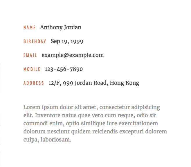
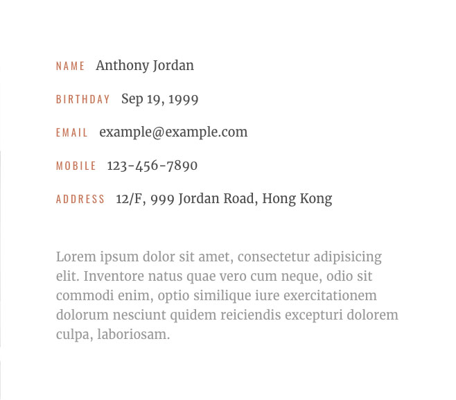
By default, many browsers nowadays smooth fonts using subpixel antialiasing. Though it can give you higher contrast and sharper text, it also makes the font look slightly bolder and leads to the color fringing problem. Adding the above CSS code will enable Chrome, Safari and Firefox to smooth the types on your webpages on the level of pixels instead of subpixels. It will decrease the contrast a bit, eliminate the color fringing problem and make the font look a bit smoother. (Lower contrast is usually desired if you want to create a more vintage look and feel.)


The difference is subtle, but it can really add this nuanced faded feel to your text which makes your readers want to touch it using their hands.
References
Font-Smooth MDN: https://developer.mozilla.org/en-US/docs/Web/CSS/font-smooth

