Surveys are a great way for us to understand our target users during the discovery phase of a UX project. Using just a Google form or Microsoft form, we can reach out to potential users, asking them questions without being constrained by time or location. Oftentimes, the hard part of conducting a survey is getting respondents. Below are 3 ways to do that.
Continue readingCategory: Videos
Learnings from Reading UX Strategy: How to Devise Innovative Digital Products that People Want
UX can mean a lot of things and has many moving parts such as interaction design, visual design and user research. Two UX practitioners can be doing wildly different things even if they are working on the same project inside the same company. UX strategy is a term I came across a few years ago, but I had never taken the time to investigate. The book UX Strategy: How to Devise Innovative Digital Products that People Want written by Jaime Levy demystifies the strategy part of UX. Reading it gave me a lot of clarity.
Continue readingLearnings from Reading About Face
About Face is a popular book in the interaction design community. Written by Alan Cooper, Robert Reimann, Christopher Noessel and David Cronin, it covers the essentials of interaction design and is packed with deep insights. Reading this book has changed the way I think about and approach interaction design, and here are my three key takeaways.
Continue readingBrainstorm Product Features Quickly Using the 5W1H Framework
What if you’re asked to propose to a prospective client a new feature for their existing product. You’ve never worked with this client before, and you’ll need to finish all this in a short period of time. How will you handle this challenge?
Recently, the design team I’m in was tasked with something similar. I proposed the idea of using the 5W1H framework to the team and moderated the brainstorming session. It turned out to be an effective one and helped us come up with some interesting new product features.
Please, Don’t Replace the Bar with the Drawer
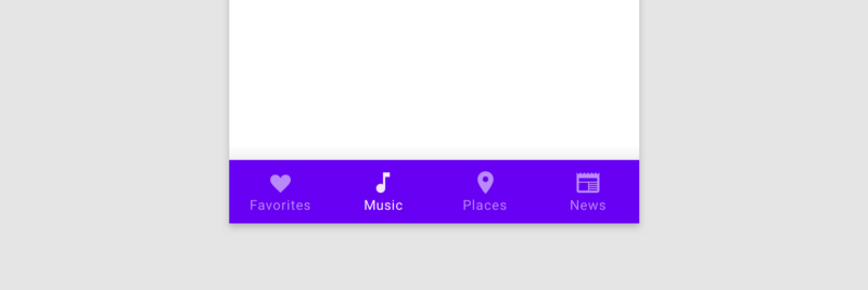
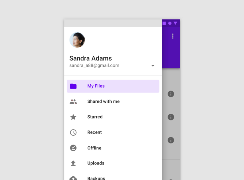
The bottom navigation bar in Material Design, which I will call the bar, also known as the tab bar on iOS, is the area at the bottom of the screen that allows the user to quickly switch between sections of an app. The navigation drawer, which I will call the drawer, is typically a side sheet that displays different app sections and is triggered by tapping the hamburger menu icon.
Both the bar and the drawer can be used for navigation purposes. Many apps nowadays seem to get rid of the bar and rely purely on the drawer, especially on Android. Without careful consideration however, this can lead to usability problems.


