Today I would like to share a small trick that can make typography on your website look a bit better. This trick is used across a lot of major websites, including Apple, AirBnB, Medium, Hulu etc.
Category: Visual Design
How to Choose A Typeface Wisely
Recently, the typeface of Samsung Galaxy Note 7’s logo really caught my attention. Its lower case letter “a” is so similar to its lower case letter “o”. It reminds of the typefaces Futura and Century Gothic which people sometimes mistakenly use for body text.

Typography plays such an important role in visual design that having a good understanding of it can really set your design apart from the crowd. Today I would like to share some insights on choosing appropriate typefaces.
Animation Design in Keynote: Cover Flow
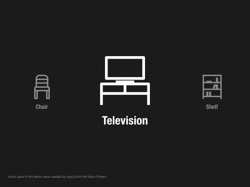
Are you a mac user? Have you used the Cover Flow feature in Finder? You can activate Cover Flow by pressing Command+4. In Cover Flow, each item will flow from right to left. At the beginning, it looks smaller. Then it turns bigger at the center. Finally, it becomes smaller again as it leaves the stage. We can actually easily achieve the same effect in Keynote using Magic Move. Today, I will show you how.
Continue reading
Animation Design in Keynote: Rotating Circles
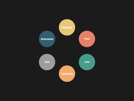
Magic Move is such a powerful feature in Keynote that it makes prototyping animations so much fun and easy. With a bit of creativity, Magic Move can be used to create some very amazing effects which can make your deck more lively and appealing. Today, I would like to share such an example, which gives an overview of all items you want to show and then goes into each of them one by one. This animation was created and used in one of my projects.


