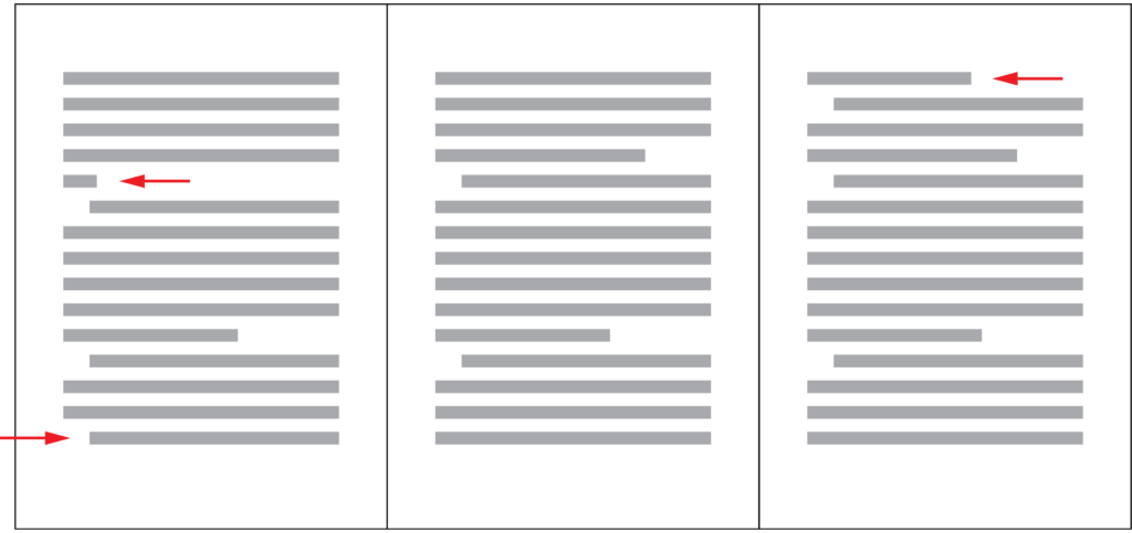
A well-designed document should be free of widows and orphans. It is understandable that getting rid of them may not always be a high priority, especially when the document you are working on is urgent or not particularly important. However, if you are working on a book, a magazine, a poster, a signage or a brochure and have sufficient time, it is worth taking some time to eliminate them because it will make your design better.

What Are Widows and Orphans?
The definitions of widows and orphans may vary. What some people call widows may be called orphans by others. Generally speaking, widows and orphans refer to the following three scenarios in a document.
- The last line of a paragraph that contains only one or two words.
- The first line of a paragraph that appears as the last line of a page / column.
- The last line of a paragraph that appears at the beginning of a new page / column.
Why Do We Want to Get Rid of Them?
A line with only one or two words will leave a trail of white space behind, creating a long gap between paragraphs, which is visually unappealing and not an efficient use of space. As far as readability is concerned, lines that become orphans or widows disrupt the reader’s flow, because he will need to flip to a new page or move to a new column to continue reading the current paragraph, in the worst case just to read one or two more words. If your book is long and has many widows and orphans, the reading experience cannot be pleasant. That’s why in professionally designed magazines and newspapers, usually you will not find any widows and orphans.
While it’s hard to completely avoid widows and orphans in webpages due to their resizable nature, when we are designing a poster, a leaflet, a PDF document, a magazine page, we should get rid of them to create a more appealing design and deliver a better reading experience. Below are three ways to solve this problem.
Soft Enter
If the paragraph text is flushed left / right, you can use soft enter (shift+enter) to manually add a line break so that more words will be added to the last line. Note that this will change the rag of the paragraph a bit, and you might need to add a few more soft enters to the previous lines to make the rag a bit more even.
This approach might not work very well for text that is justified, because it may add additional the word spacing to lines that lose a word, creating too big a gap between words.
Adjust Letter Spacing
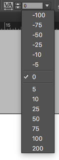
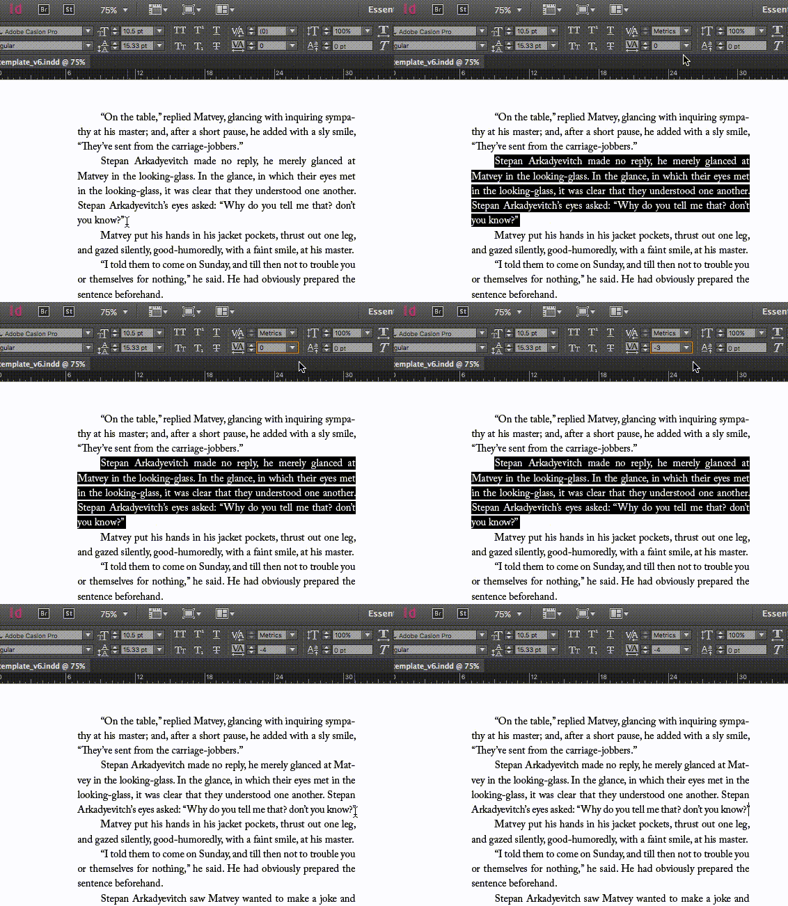
This approach can be applied to paragraph text that is flushed left / right or justified. First, select the whole paragraph that contains the orphaned words or line. Then adjust the amount of letter spacing. A negative letter spacing will bring letters closer together and pull the orphaned words or line back to the previous line, while a positive letter spacing will add more space between letters and push more words to the last line or create a new line. If you are trying to get rid of the first line of a paragraph that appears at the bottom of a page / column, you may want to adjust the letter spacing of the previous paragraph instead.

Remember to experiment the values between -30 to +30. Letter spacing beyond this range will have a significant impact on the texture of the paragraph and make it look different from the rest of the document.

Adjust Line Length
If you are allowed to adjust the width of the paragraph, you can get rid of widows and orphans by experimenting with different line lengths. However, if you have many paragraphs in your document, this may not be the ideal approach, because it will be more difficult to find a line length that works for all the paragraphs. Furthermore, changing the line length will affect the layout of the page.
Final Thoughts
Eliminating widows and orphans takes time and some trial and error. I hope that after reading this article, you will know what widows and orphans are and know how to get rid of them to make the typography in your design better.
Survey
Do you like this article? What are your struggles related to typography? Answer this short survey and let me know. It will help me create the best content related to typography for you.

