About Face is a popular book in the interaction design community. Written by Alan Cooper, Robert Reimann, Christopher Noessel and David Cronin, it covers the essentials of interaction design and is packed with deep insights. Reading this book has changed the way I think about and approach interaction design, and here are my three key takeaways.
Continue readingTag: UX
Poorly Designed Interface Makes Oven Hard to Use
We talk a lot about the designs of mobile apps and websites. Companies, start-ups hire the best designers to craft the best UX for their digital products, but we seem to ignore the UX of physical products. User interfaces of a lot of home appliances, such as oven, stove top, dish washer, washing machine, are often not intuitive and hard to use.
Recently I moved into a new apartment and tried to cook. I was confused by the buttons and knobs on the panels of an oven and ended up spending much time trying to figure out how to turn it on.
The UX of Hero Banners
Hero banners are common but to design them well may not be easy. Here are two articles and a video related to the UX of hero banners that you probably don’t want to miss.
Brainstorm Product Features Quickly Using the 5W1H Framework
What if you’re asked to propose to a prospective client a new feature for their existing product. You’ve never worked with this client before, and you’ll need to finish all this in a short period of time. How will you handle this challenge?
Recently, the design team I’m in was tasked with something similar. I proposed the idea of using the 5W1H framework to the team and moderated the brainstorming session. It turned out to be an effective one and helped us come up with some interesting new product features.
Please, Don’t Replace the Bar with the Drawer
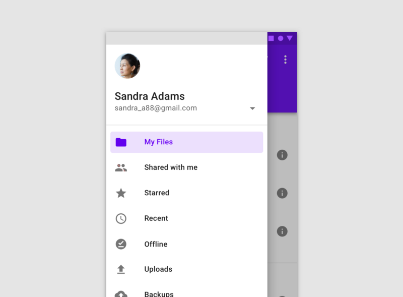
The bottom navigation bar in Material Design, which I will call the bar, also known as the tab bar on iOS, is the area at the bottom of the screen that allows the user to quickly switch between sections of an app. The navigation drawer, which I will call the drawer, is typically a side sheet that displays different app sections and is triggered by tapping the hamburger menu icon.
Both the bar and the drawer can be used for navigation purposes. Many apps nowadays seem to get rid of the bar and rely purely on the drawer, especially on Android. Without careful consideration however, this can lead to usability problems.


