A complex software application often involves multiple personas, several user journeys, and complicated interactions between different user groups. Without a thoughtful design, these complexities can be overwhelming and frustrating: Users are forced to deal with a cluttered UI with overloaded features, or to search for an obscure button or command, or to figure out a user flow that’s hard for laymen to understand. As a result, they get lost while using the software and are forced to seek help or go through trainings.
Instead of forcing the users to learn and adapt, how can we design an application in such as way that it proactively tries to help the users? Well, one way to do that is to predict the user intent using various contextual cues, such as the user’s skill level, the content the user is working on, etc, and present the right features at the right stage of the user journey through an adaptive UI.
Intelligently Adaptive
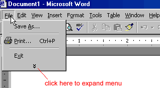
It’s not hard to come across some basic form of adaptiveness in the UIs of many existing applications. We saw earlier versions of Windows or Office automatically hide rarely used features in their menus. We saw Adobe applications such as Photoshop or Premiere offer users the possibility to switch between different UI presets designed for different personas or use cases. We also saw the the side panel in Pages or Keynote change based on the element being edited. I believe we can take this idea even further.


For instance, when a user begins using the application for the first time, she’s a novice, and there’s little interesting data from the database to show. The complex application probably also needs input from the user to be properly configured. Instead of showing an empty state and waiting for the user to figure things out, help her onboard: show her the quick actions that she needs to take to properly set up the software; tell her what the application has to offer by showing her video tutorials or links to those tutorials.
After the application is set up and the user onboard, the needs and goals of the user start to shift towards creating and editing data and performing the key tasks of the application. At this stage, bring the next set of features or quick actions that could be useful to her to the front based on the possible use cases. The idea is to always think one-step ahead and actively guide the user so she can get up to speed more quickly and reaches her goals faster and feels that she’s being taken care of. For applications that people are unfamiliar with, designing the UI this way is even more important.

The core of an excellent adaptive UI is the accurate prediction of user intents, needs and goals. Imagine how much more intelligent and helpful the application can be if the it takes into account rich signals such as the the types of content the user is creating, or the amount of text inside the document, or the number of hours the user has spent inside the software, etc, and adapts and displays the most appropriate and relevant features thorough the UI.
Final Thoughts
So it seems that there’s still a lot we can do to make adaptive UIs even better. To make it happen requires close collaborations between designers, engineers, and perhaps scientists too. I’m excited about a future where we’ll experience the next-level of user-friendliness in our digital products through an intelligent adaptive UI.

