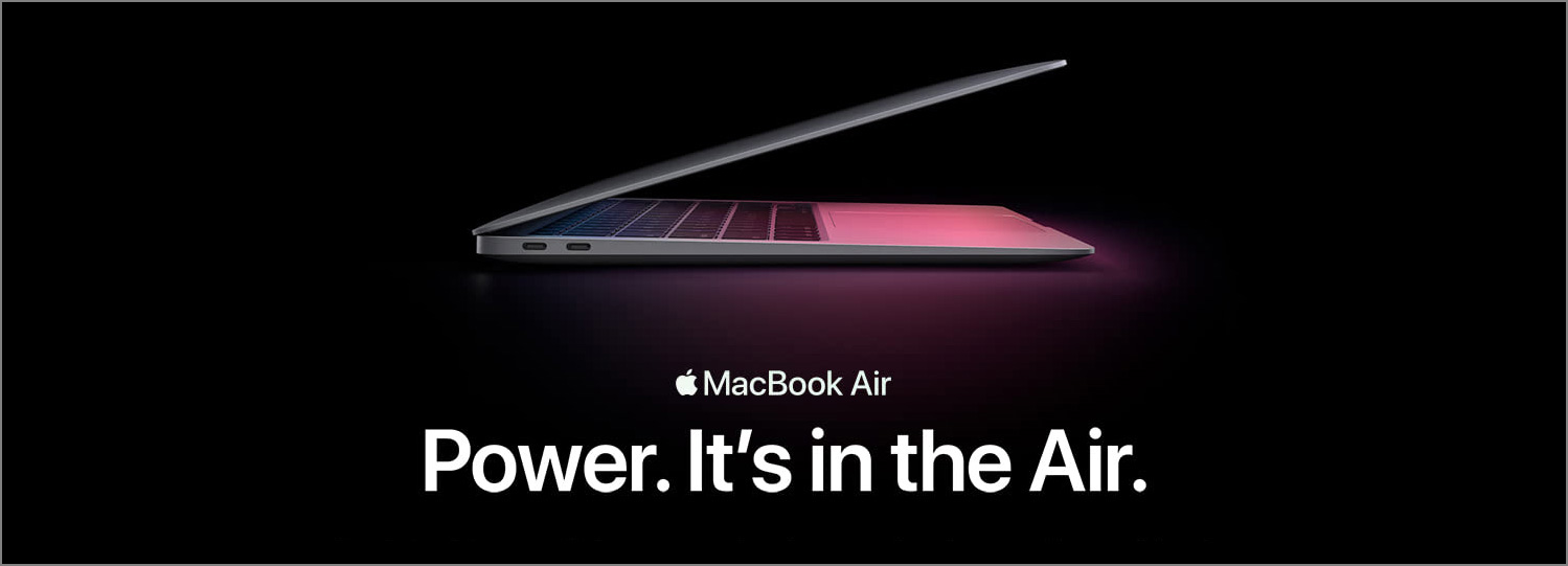
Hero banners are common but to design them well may not be easy. Here are two articles and a video related to the UX of hero banners that you probably don’t want to miss.
You Might Want to Think Twice before Using a Carousel
Carousels are rotating hero banners. The potential pitfalls of using a carousel are that the first slide gets much more exposure, and that banner blindness could prevent the information within the carousel from being effectively communicated to the user. Furthermore, for a carousel to be user-friendly on both mobile and desktop, it needs to meet quite a few UX requirements. According to the following article, the usage of carousels is declining on e-commerce websites. Instead of using a poorly designed carousel which causes usability problems, the article suggests static images as the alternative, which are simple and effective.
9 UX Requirements for Designing a User-Friendly Homepage Carousel (If You Need One)
Beware of Banner Blindness
Users have learned that hero banners often contain marketing information which may not be valuable to them. If a carousel or hero banner looks too similar to an ad, they may simply ignore it. This behavior is explained in detail in the video below. If the information inside a hero image or the content it links to is important, make sure that there are multiple ways to access it.
Banner Blindness: Ad-Like Elements Divert Attention (Video)
Scale Hero Images Properly
If not handled properly, the images of a hero banner could be scaled disproportionately, cropped and repositioned when the viewport changes. The article below offers several methods to resolve these problems, including scaling and cropping, carefully choosing a good image etc.
Small Pictures on Big Screens: Scaling Up from Mobile to Desktop
That’s it. That’s what we should pay attention to when designing a hero banner or a carousel. Hope you find the articles and video helpful.

