Bad designs have real consequences. I’ve lost my groceries and almost lost my bank card because of — well, bad designs.
The Train Seats
Living in Toronto, I rely on the TTC subway to travel around the city. After boarding the train, I always try to avoid Seat A and B next to the window, which are shown in the following picture. Why? Let me explain.
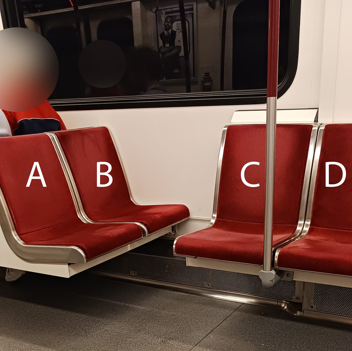
As you can see, there’s little leg room between Seat B and C. Sitting on Seat B apparently won’t be very comfortable, but there are two bigger problems here. Firstly, placing Seat C so close to Seat B and making it perpendicular to Seat B create an affordance for people to put their feet on it, turning it into a perfect leg rest, which leads to hygiene problems and reduced usage of Seat C. It won’t be hard for you to find people doing just that on the train.

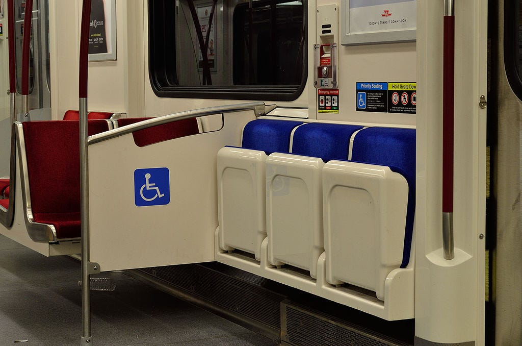
Secondly, because Seat B is uncomfortable to sit on, and because when it’s near priority seats, there’s a panel in front of it to help create a little corner, Seat B in this case has become a perfect spot for putting bags and other belongings. (There tends to be less traffic on the TTC subway compared to, for example, the mass transit systems in Asia.) So, I once found myself sitting on Seat A, placing my groceries on Seat B, only to realize that I’d left them on the train after getting off. This happened to me not just once, but twice. The first time, I got back my groceries with the help from station staff. The second time, I didn’t try to do that because I couldn’t be bothered to go through the whole lost-and-found process again. Because of these two experiences, I never sit on Seat A or B from then on.
A poor design of train seats can make you not only feel uncomfortable, but also lose your belongings.
The ATM
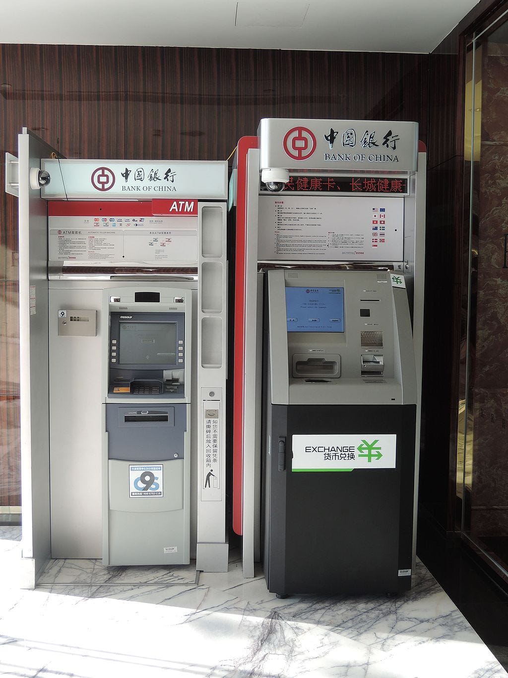
Recently, I tried to get some cash from an ATM in mainland China. Because mobile payment was so popular there, getting cash out of an ATM wasn’t something I needed to do very often, but on this occasion, cash was what I wanted.
I walked to an ATM, inserted my bank card, entered the amount I wanted to withdraw, and got my cash. Everything seemed fine to me until two days later, I couldn’t find my bank card in my wallet any more.
I tried to think about what had happened. Only then did I realize that I’d forgotten to take my card after using the ATM. In Hong Kong, the ATMs always return your card first before giving you the cash. I’d become so used to how things work there that I forgot that ATMs in mainland China spit out cash first before giving you the card.
My heart sank. I was worried, because someone might have already stolen my card. I went back to the bank where the ATM was located. Luckily, the card was there, probably because the ATM had taken it back after it was ejected and left outside for too long.
A small detail in design, such as the order of ejecting cash and a card, can have a huge impact on how likely a user makes mistakes. If an ATM gives us the card first, we’ll take our card then our cash, and everything will be fine. If this order is reversed, then quite likely, we’ll happily take our cash and then walk away from the ATM, leaving our card in the machine without realizing it, and this, could cause great financial losses.

Final Thoughts
Good designs are thoughtful considerations. They are so good that they fade into the background. You don’t feel them. You just feel the lack of them through problems and pains.
Years ago, I also talked about how the problematic design of the interface of an oven made it hard to use. Looking at the designs of physical products allows us to appreciate what design really encompasses and examine how it affects user experience, thereby enabling us to create better digital products through similar principles.
