Design is a vaguely defined term, and people tend to have misconceptions about what designers do. When you tell people you’re a designer, especially those outside of tech, chances are they will think that your job is to sit in front of a monitor, pushing pixels and make things look beautiful.
When design is mentioned in the tech industry, quite often it refers to user experience design or product design, and it’s much more than just producing beautiful mockups. In fact, the field of UX is so broad that it took me years of learning and practicing to realize what it really encompasses. The following chart shows the different parts of UX I’ve come across so far.

If you plan to become a designer in tech, you might have already heard of these terms, but before we talk about each of them, let’s take a look at the following model from the book The Design of Everyday Things written by Don Norman, which captures the high-level human cognition and emotions involved when we experience a product or service.
The Human Cognition and Emotion Model
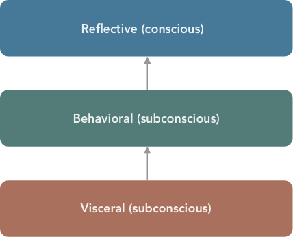
There are three levels in this model: visceral, behavioral and reflective. The visceral level is about perceptions, which include appearance, sound, smell and touch. Perceptions are gut feelings, which subconsciously help users formulate an impression of a product, even before they start using it. The behavioral level is about people’s actions, and with every action comes an expectation. For instance, when using the metro systems in many big cities, passengers tap their cards on the card readers installed on the gates and expect the gates to open. When people shop in China, they take out their phones, open WeChat, show the cashier their QR code and expect the cashier to scan it to deduct money from their phones. These are the actions they take to complete a payment. Lastly, the reflective level is about conscious reflection and evaluation. This happens after the use of a product. At this level, people are consciously evaluating the value of a product. Take mobile payment as an example again. Users may find it convenient to use a QR code generated by an app to settle payments and therefore decide to stick with the app and this payment method. They might even decide to write a review or give the product a rating.
When I was asked about my definition of UX design in a job interview, I like to base my answer on the model above. It reminds me that UX design is not just about visuals. It in fact takes care of a lot more human cognition and emotions.
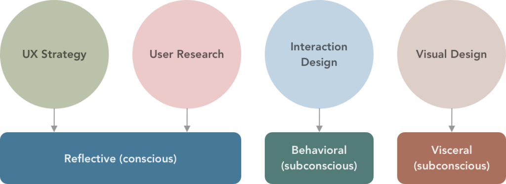
With this model in mind, we can connect the different parts of UX to our cognition and emotions. Apparently, visual design sits at the visceral level because it’s about our perception of sight. Interaction design sits at the behavioral level because it takes care of people’s actions, or interactions with the product. Even though the insights from user research can inform the design of interactions or visuals, and even though good researchers are keen observers of users’ subconscious behaviors, I’d put user research at the reflective level, because so much of it is about asking for users’ reflection on past experience or listening to their feedback of a product. Last but not the least, because a large part of UX strategy is about formulating a proper value proposition of a product, it makes sense to put it at the reflective level as well, where products will be evaluated by the users.
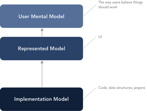
To go beyond the visceral level and into the behavioral level, one of the core concepts that we should master is the user mental model, which is the key to designing smooth interactions. This is how users believe things should work. It’s closely related to two other concepts — the represented model, which is the UI, and the implementation model, which is how the underlying components such as code, data structures truly work. These three concepts are discussed in detail in the book About Face written by Alan Cooper, Robert Reimann, Christopher Noessel and David Cronin. As designers, it’s our job to find out the user mental model, and to nudge the represented model closer to it, so we can reduce/remove friction for the users.
The human cognition and emotion model gives us a wholistic view of UX/Product design. There isn’t an aspect in the model that isn’t important that doesn’t affect the experience of a product/service. I’ve heard designers focusing on getting the user flow and interactions right call designers who focused on aesthetics useless online. I’ve also heard designers who like creating visuals get annoyed when they heard other designers talk about product strategy. These are all examples where we too narrowly focus on one aspect of design, and fail to notice another.
User-Centered Design
User-centered design (or user-centric design, human-centered design) is a term I learned when I was studying HCI. It’s the ideal process for UX design. It focuses on the traits, behaviors, needs and goals of the users, and leverages them to design an appropriate solution. To create a successful product is not easy. A lot is at stake. This is especially true for startups. The purpose of user-centered design is to mitigate risks and to make sure that what we build is truly desired by the users.
Solving real problems but not symptoms is a requirement in user-centered design. When working on a project, it’s easy to get blinded by symptoms — often certain metrics that we want to improve — and to fail to dig deeper to uncover to the real underlying problem. The consequence of this is that we ended up creating ad-hoc solutions that don’t address real user pain points or needs. Don Norman has a video that talks about what human-center design really is.
The Double Diamond Design Process
The ideal way to apply user-center design is the double diamond design process, in which two divergent phases are followed by two convergent phases. We start by doing user research to listen to the users, which is divergent. Then we derive user traits, needs and goals from our research findings, which is convergent. We ideate different solutions to meet those needs and goals, which is divergent. Then we quickly build some prototypes, test them, eliminate those that are not working and iterate on those that seem promising, which is convergent.
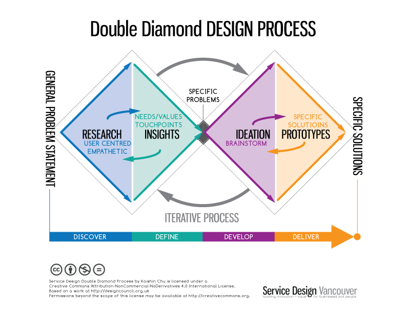
In the real world, such a process can be incomplete, especially when stakeholders don’t know a lot about user-centered design. Designers sometimes will need to figure out when to do what based on the specific project and circumstances they are in.
The Moving Parts of UX Design
Now that we’ve looked at the human cognition and emotion model and user-centered design, let’s dive into the different moving parts of UX design.
UX Strategy
The strategy part of UX is the overall game plan for creating a winning product. It’s about searching for the right value proposition, defining the right problem to solve for the right people. We often have certain assumptions about who our users are and what problems they have, but do people like that really exist? Do they really need a solution like our proposed one? Customer discovery can answer those questions.
Competitor analysis can help us see clearly the market landscape. We can know how saturated the market is, what other competitors are offering, what we’ll need to offer to differentiate us from competitors.
User Research
User research can be done before we have a product/feature or after we build a prototype.
Before we have a product/feature, techniques such as user interviews, survey, contextual inquiry, diary study can be used to gain insights into user traits, behaviors and pain points.
After we build a prototype, techniques such as think-aloud, eye tracking in usability test can be used to identify any discoverability or understandability problem. The feedback gathered can be used to inform the design of the product in the next iteration.
Interaction Design
Interaction design is concerned with user mental model, traits, behaviors and thoughts. Through interaction design, we can make our products smart and considerate. By aligning user flows with user mental model, we can remove friction, create smooth interactions and help users complete their actions faster, though sometimes we also intentionally add friction to help users prevent errors.
If a product has usability problems, usually it implies that the design of interactions doesn’t fit the user mental model well.
And here are some specific examples related to interaction design.
- Always Explain Why the ‘Phone’ Field Is Required (58% of Sites Don’t)
- Why is it important to support non-product search?
- Please, Don’t Replace the Bar with the Drawer
Visual Design
Visual design is where all the pixel pushing happens. It’s about achieving a specific visual style through layout, typography, colors etc to evoke a visceral response from users to help them build trust and engage with the brand or product.
Final Thoughts
In this article, we learn about the human cognition and emotions involved in user experience, the concepts of user mental model and user-centered design, and the four moving parts of UX. Whether you plan to become a UX designer in tech or are already working as a practitioner, I hope that the information above can give you a deeper understanding of UX/product design, and help you find out the areas you want to specialize in or learn more about.
